If you often include tables in your presentations, file this script under “Gotta have that!” Using this script tool, you can instantly morph the data from a selected table row or column into a pie chart placed on a new slide, automatically inserted after the slide with the selected table. Ah, “morph and repeat” the presenter’s equivalent to “wax on, wax off.”
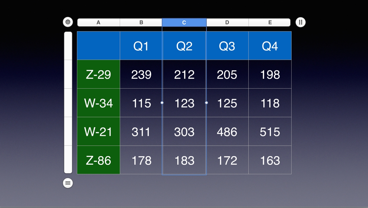
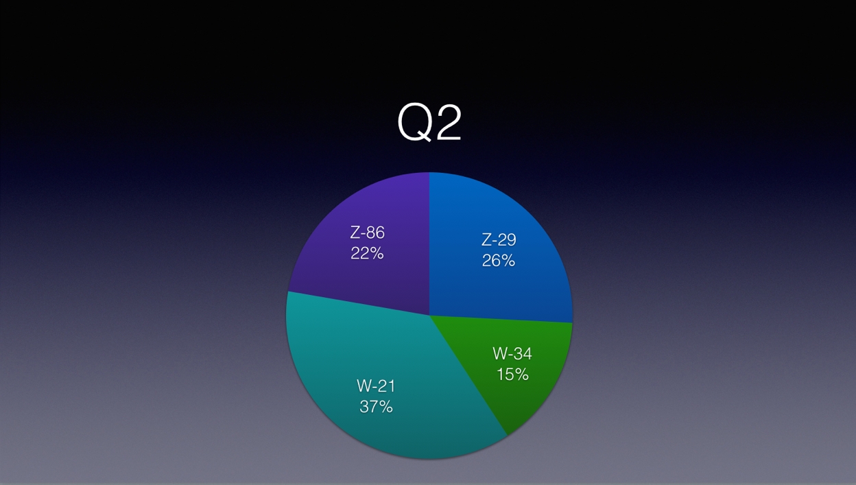
(⬆ see above ) A column selected in a table on a slide. (⬇ see below ) A pie chart created on a new slide using the data from the selected table column. (formatting adjusted by hand)
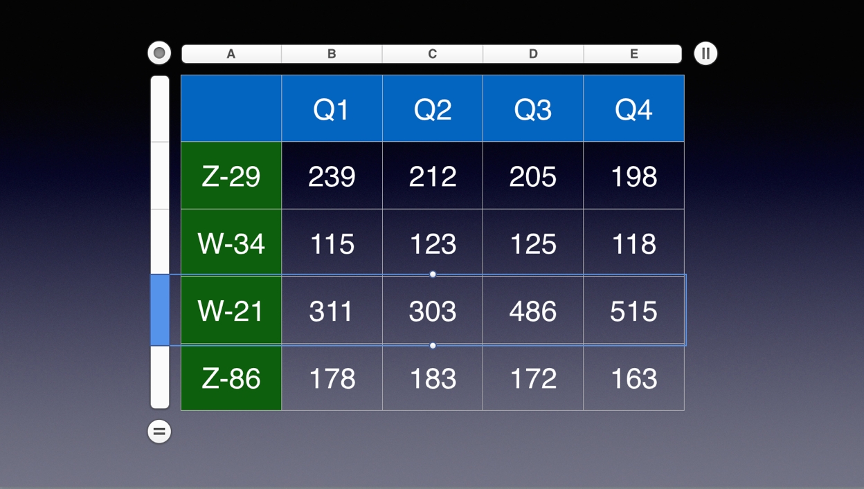
And using a selected table row:
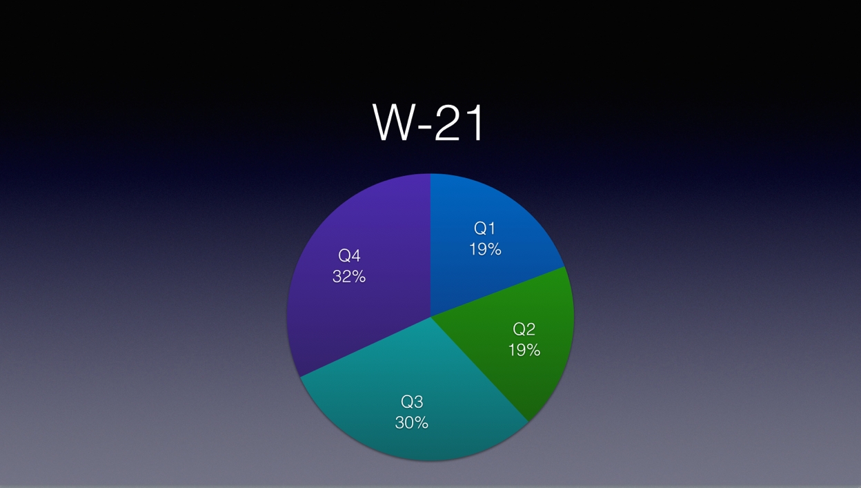
(⬆ see above ) A row selected in a table on a slide. (⬇ see below ) A pie chart created on a new slide using the data from the selected table row. (formatting adjusted by hand)
And here’s the script:
IMPORTANT TIP: Learn how to save and run your favorite scripts using the system-wide Script Menu.
Pie Chart from Selected Row|Column
01
tellapplication "Keynote"
02
activate
03
try
04
-- check for document
05
if not (existsdocument 1) then errornumber 1000
06
telldocument 1
07
try -- check for selected table
08
tellcurrent slide
09
set theselectedTableto ¬
10
(the firsttablewhoseclassofselection rangeisrange)
11
end tell
12
on error
13
errornumber 1001
14
end try
15
tellselectedTable
16
-- get the count fo the various headers and footers
17
set theheadercolumnCounttoheader column count
18
set theheaderrowCounttoheader row count
19
set thefooterrowCounttofooter row count
20
-- store references to the intersecting columns and rows
21
settheseRowsto therowsof theselection range
22
settheseColumnsto thecolumnsof theselection range
23
-- get the row and column counts
24
setrowCountto (countoftheseRows)
25
setcolumnCountto (countoftheseColumns)
26
-- check for errors
27
if (rowCountis not 1) and (columnCountis not 1) then
28
errornumber 1002
29
else if (rowCountis 1) and (columnCountis 1) then
30
errornumber 1002
31
end if
32
ifheaderrowCountis greater than 1 then
33
errornumber 1003
34
end if
35
ifheadercolumnCountis greater than 1 then
36
errornumber 1004
37
end if
38
-- get the column names
39
set columnNames to {}
40
ifheadercolumnCountis not 0 then
41
repeat withifrom 1 to thecountoftheseColumns
42
setthisValueto (thevalueof the firstcellof (itemioftheseColumns))
43
ifthisValueis notmissing valuethen
44
set the end ofcolumnNamestothisValue
45
end if
46
end repeat
47
end if
48
-- get the row names
49
setrowNamesto {}
50
ifheaderrowCountis not 0 then
51
repeat withifrom 1 to thecountoftheseRows
52
setthisValueto (thevalueof the firstcellof (itemioftheseRows))
53
ifthisValueis not missing value then
54
set the end ofrowNamestothisValue
55
end if
56
end repeat
57
end if
58
end tell
59
-- add the chart to a new slide inserted after the current slide
Mention of third-party websites and products is for informational purposes only and constitutes neither an endorsement nor a recommendation. MACOSXAUTOMATION.COM assumes no responsibility with regard to the selection, performance or use of information or products found at third-party websites. MACOSXAUTOMATION.COM provides this only as a convenience to our users. MACOSXAUTOMATION.COM has not tested the information found on these sites and makes no representations regarding its accuracy or reliability. There are risks inherent in the use of any information or products found on the Internet, and MACOSXAUTOMATION.COM assumes no responsibility in this regard. Please understand that a third-party site is independent from MACOSXAUTOMATION.COM and that MACOSXAUTOMATION.COM has no control over the content on that website. Please contact the vendor for additional information.